背景
我们做的是后台类型的管理系统,因此相对应的表单就会很多。
相信做过类似项目的老哥懂得都懂。
因此我们希望能够通过一些相对简单的配置方式生成表单,不再需要写一大堆的组件。
尽量通过数据驱动。
思路
不管是哪个平台,思路都是相通的。
1.基于UI框架封装
react我们基于antd封装。
vue我们基于element封装。
这两个框架下的表单,几乎都满足了我们对表单的需要,只是需要写那么多标签代码,让人感到厌倦。
2.如何根据数据驱动
想要简化标签,首先就需要约定数据格式,什么样类型的数据渲染什么样的标签。
那么我可以暂定,需要一个type,去做判断,渲染什么样的表单内容标签(是的,if判断,没有那么多花里胡哨,最朴实无华的代码就能满足我们的需求)
3.确定需要渲染的标签
业务中其实常用的表单标签就如下几类:
selectcheckboxradioinput(包括各个类型的,password,textarea之类的)switch
等等,需要再加
4.类型需要传递下去
需要把表单可能用到的属性传递下去。
实现
因为我们在vue和react上都有,所以我会给出两个框架的封装代码。
Vue
我使用的是vue3+element-plus
封装两个组件,Form和FormItem
代码如下:
Form
1 | <!-- Form/index.vue--> |
FormItem
1 | <!-- FormItem/index.vue--> |
这里要注意的点是v-bind="$attrs"
因为我们不可能将所有组件可能用到的
props都写在这并导出没,而且也没有这个必要。所以我们可以用到vue提供的$attrs来帮助我们透传下去
使用
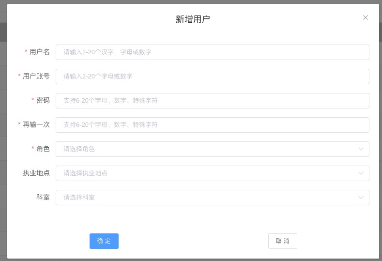
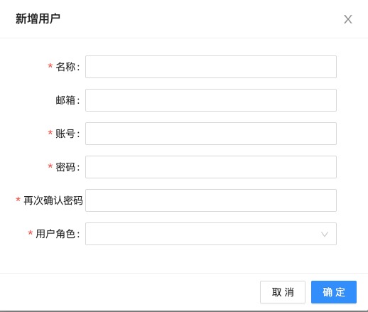
比如像这样一个表单
我们只需要如下代码
Rules规则是我们单独定义的符合async-validator的规则,这里就不写引入了
1 | <template> |
我们只需要聚焦数据,就可以构造出一张表单。
React
也是相似的,而且较之Vue的更加灵活,除了我们上述的这种常用表单,我们可以把后台管理的搜索项也认为是表单
Form
1 | import React from 'react'; |
需要注意的点
form的引用实例由外部传入- 取值赋值通过
formInstance做,因为和vue不一样,react做父子双向绑定比较复杂,所以建议是不要做成受控组件
FormItem
1 | import React from 'react'; |
这里要注意的点
- antd的FormItem,似乎不允许HOC(反正我试过是会出bug),也就是说判断渲染组件需要放在Item组件的内部做,不能单独抽出方法render!
- A List of antd’s components that cannot work with HOC
使用
例如下面两个例子

1 | import React, { useEffect, useState } from 'react'; |
1 | import React, { useEffect, useState } from 'react'; |